

Case Study: Pearls
OVERVIEW:
The product:
Pearls is a bubble tea ordering app that strives to deliver healthy, gluten-free, dairy-free bubble tea alternatives, which is lacking in the market.
the problem:
Most bubble tea ordering apps are not fully customizable and do not address people with health and/or dietary restrictions.
THE GOAL:
Pearls accomplishes to have users pick bubble tea options and modify according to the person’s dietary restrictions.
ROLE:
Lead UX Designer & Research, from conception to delivery
duration:
3 months
RESPONSIBILITIES:
Strategy, conducting interviews, paper and digital wireframing, low and high-fidelity prototyping, conducting usability studies, accounting for accessibility and applying iterations on designs
Tools used:
Pen and paper for sketching and wireframing, Figma and Miro for concept artboards and Figma for design and prototyping.

UNDERSTANDING THE USER:
user research summary:
I conducted user interviews and created empathy maps to better understand the users I’m designing for and their needs. A primary user group identified were young adults who have fast paced lifestyles and love to customize their bubble tea orders. These were common issues: no customizations, no gluten-free/dairy-free options & no space for people to indicate their dietary restrictions.
The user group confirmed initial assumptions about bubble tea customers. After an extensive competitive audit report of three other companies, there were opportunities to offer customization options that emphasize healthy ingredients and dietary alternatives. I also explored incorporating assistive technologies.
While incorporating all of these findings, it was also important to bring trust, transparency and quality in products, but making them fun and playful at the same time.
user research pain points:

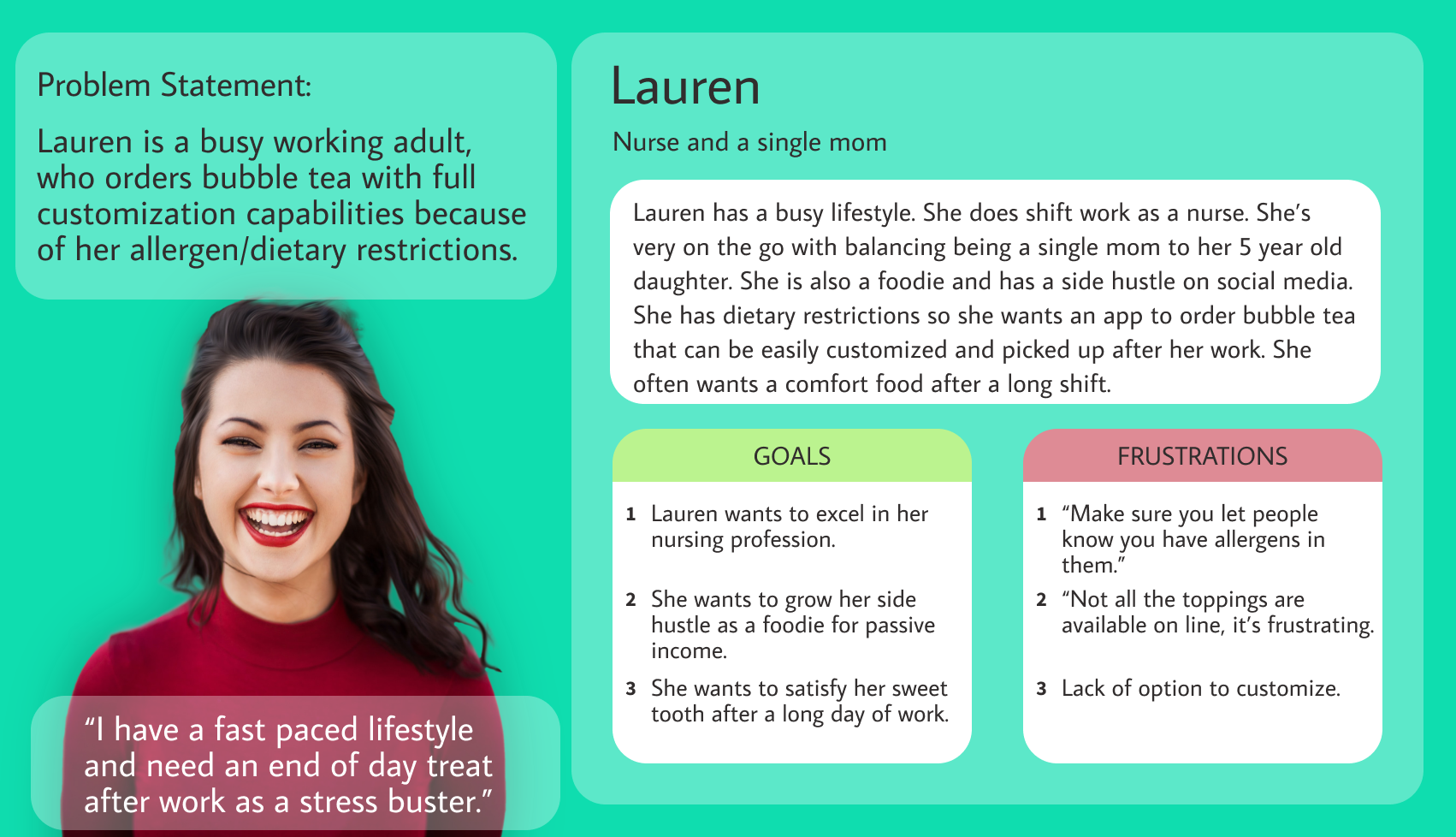
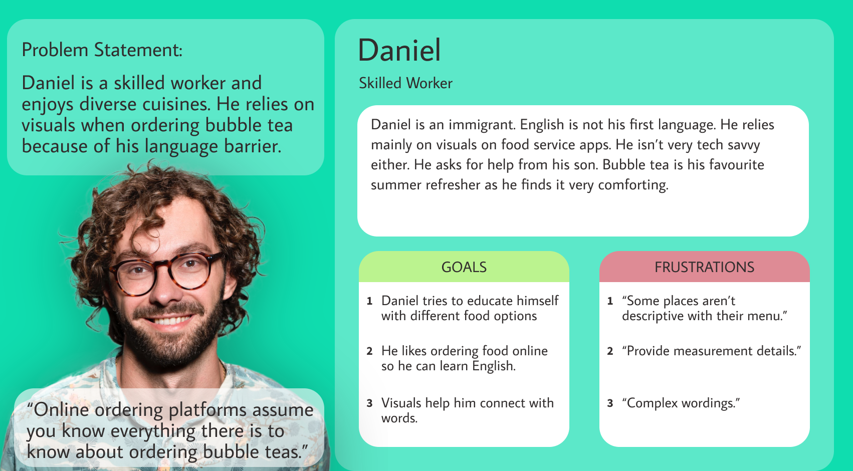
personas and problem statements:
journey maps:
The need for customization and ability to emphasize dietary restrictions is very evident with Lauren’s ordering journey.

Visuals and accessibility is an important feature that will cater to all individuals, most especially to Daniel’s ordering journey.

STARTING THE DESIGN:
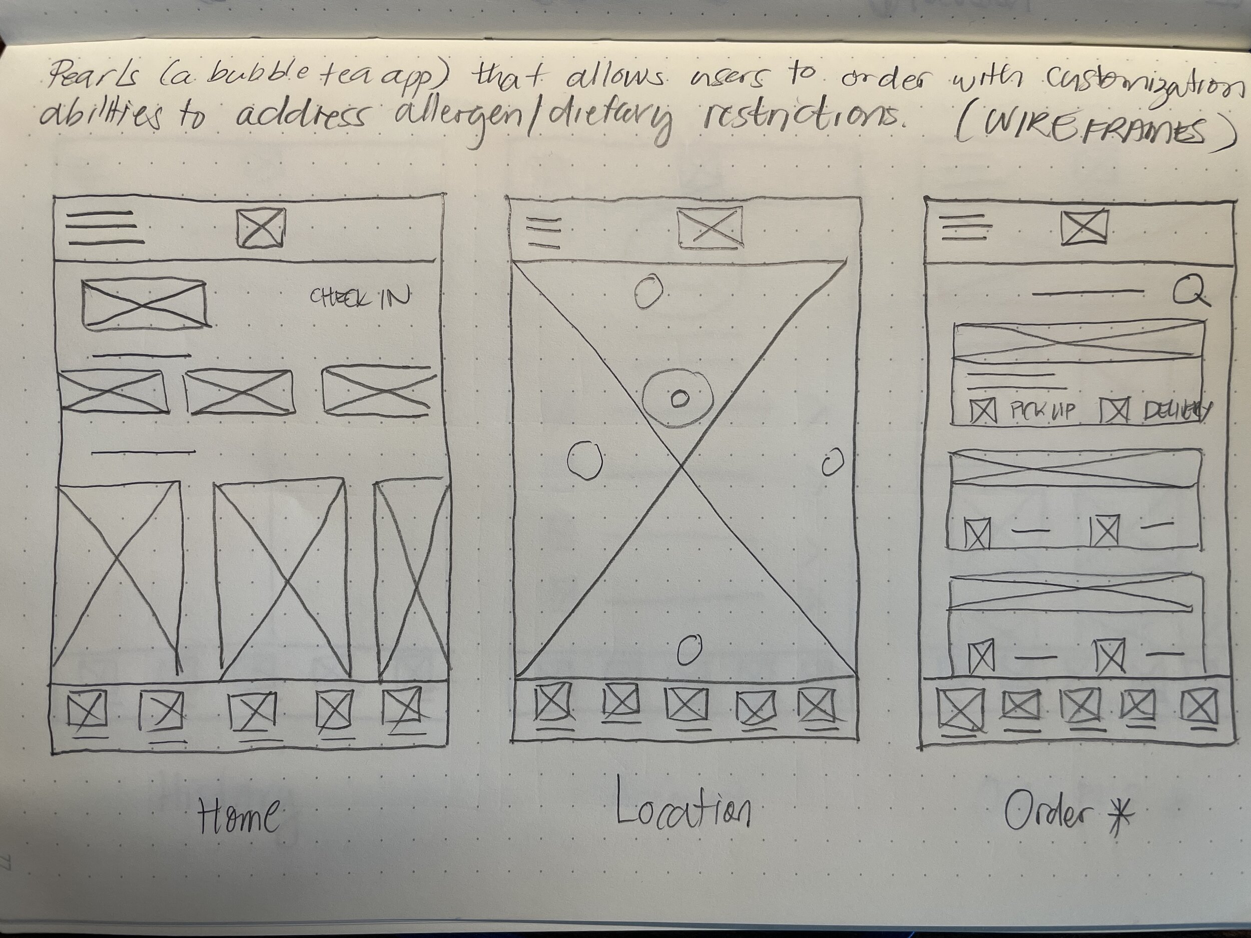
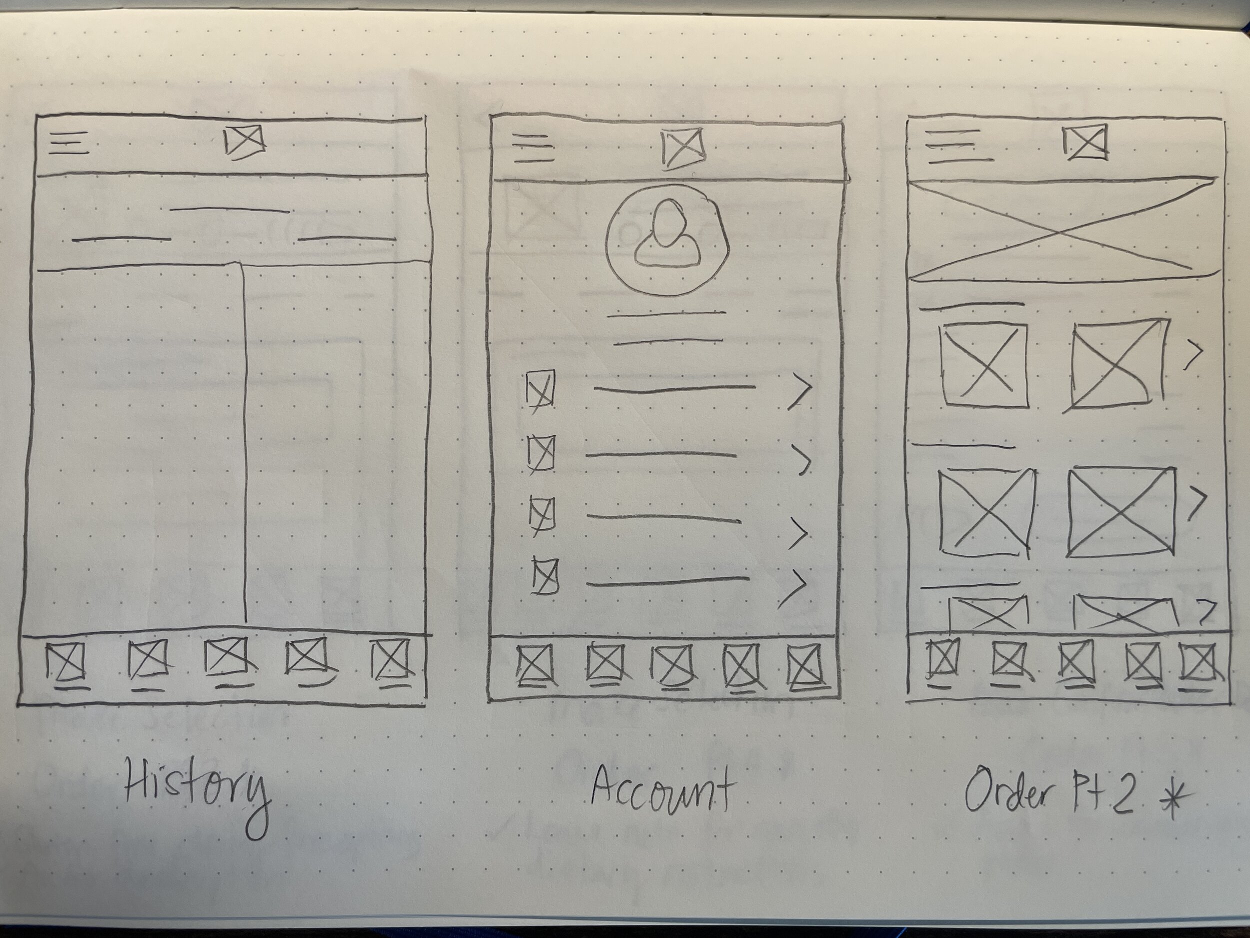
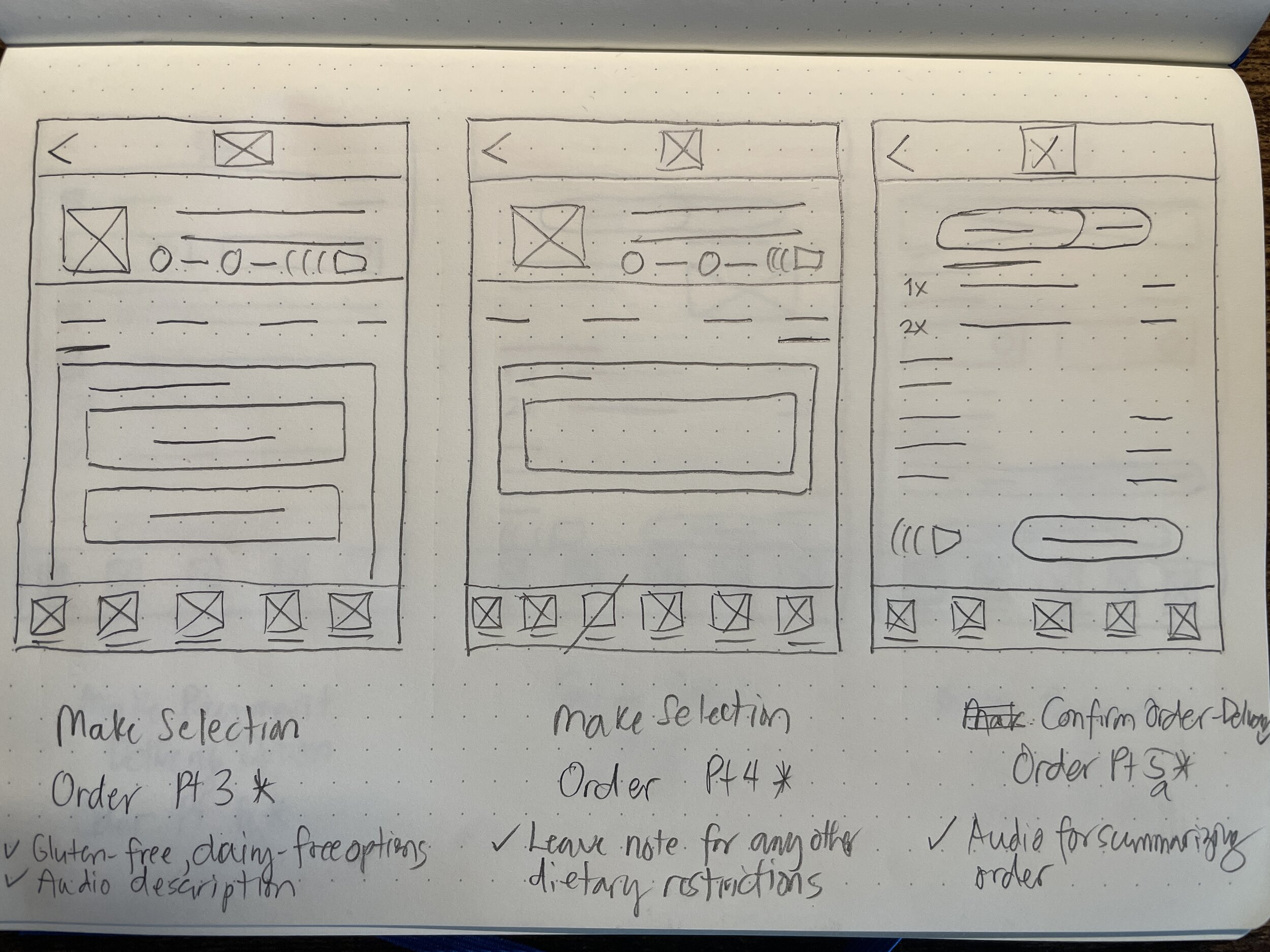
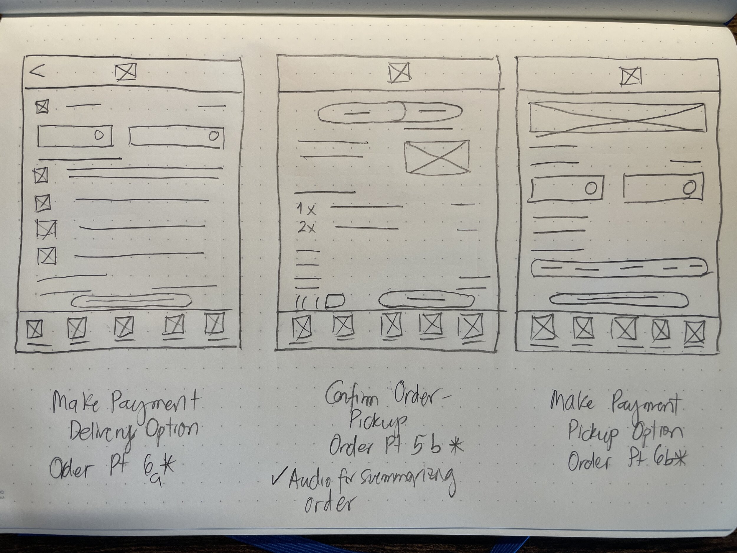
PAPER WIREFRAMES:
Drafting iterations of the app on paper ensured elements made it to digital wireframes addressing user pain points.
digital wireframes:

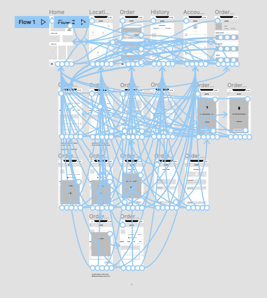
low-fidelity prototype:
Prototype explores flow from locating bubble tea spot to full process of ordering (modifying ingredients to adding dietary customizations, confirming order and making payment). Check low-fidelity prototype.
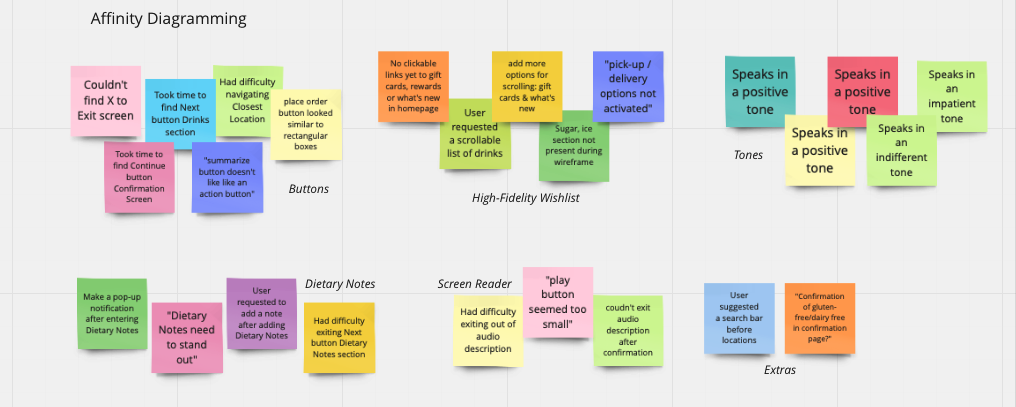
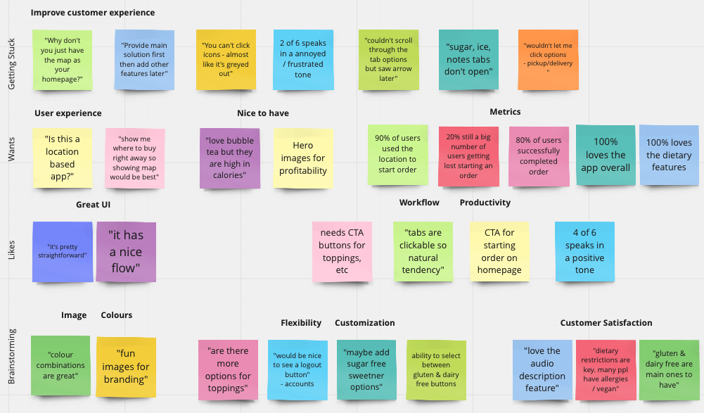
usability study findings:
I conducted two rounds of usability studies. Findings from the first study helped guide the designs from wireframes to mockups. Affinity diagrams below helped indicate patterns/themes that evolved into insights. The second study used a high-fidelity prototype and revealed what aspects of the mockups needed refining. Summary of the findings are provided below.

REFINING THE DESIGN:
mockups:
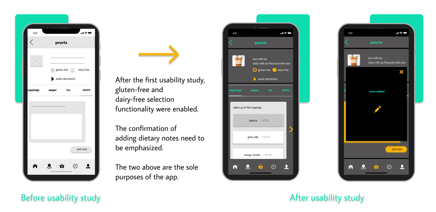

high-fidelity prototype:
The final high-fidelity prototype presented cleaner user options and individual routes for gluten-free and dairy-free. Scrollable modifications (toppings, sugar, ice, etc) made it more efficient. View high-fidelity prototype.


