Case Study: Ohana Travels
OVERVIEW:
The Idea:
A travel app that seamlessly & affordably books activities in Hawaii. It helps fund local businesses to help build stronger communities. With each purchase, 5% help fund the homeless population of Hawaii. It’s a travel app that aims to educate & raise awareness that Hawaii has the largest homeless per capita in the US.
DISCOVERY:
RESEARCH PLAN:
I was able to reach out to 24 individuals to gauge on their general knowledge about Hawaii & their travel habits. I further interviewed 8 other individuals to probe deeper based on what they have provided.
Results presented an opportunity to enhance booking activities affordably & seamlessly on the islands of Hawaii, a one stop site focused on the concept of giving back & curating a “local experience.”
Competitive Analysis:
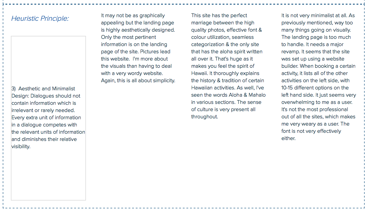
After meticulous analysis of 3 similar travel websites, I was able to gather & apply key heuristic principles to my own app.
It must be socially conscious of varying technological inclinations. I particularly liked one of the site's transparency page about the charity component of their business: Ohana First, which lead me to incorporate it's core standards into my own app.
A good flow indicator for the purchase process makes a site very efficient and user-friendly, which I have utilized as well.
The sites had a perfect mix of high quality photos, effective font, colour utilization & seamless categorization. Aesthetically, bringing the “spirit of aloha” on the site made a great impact to me as a consumer & other travelers.
Personas & Empathy Mapping:
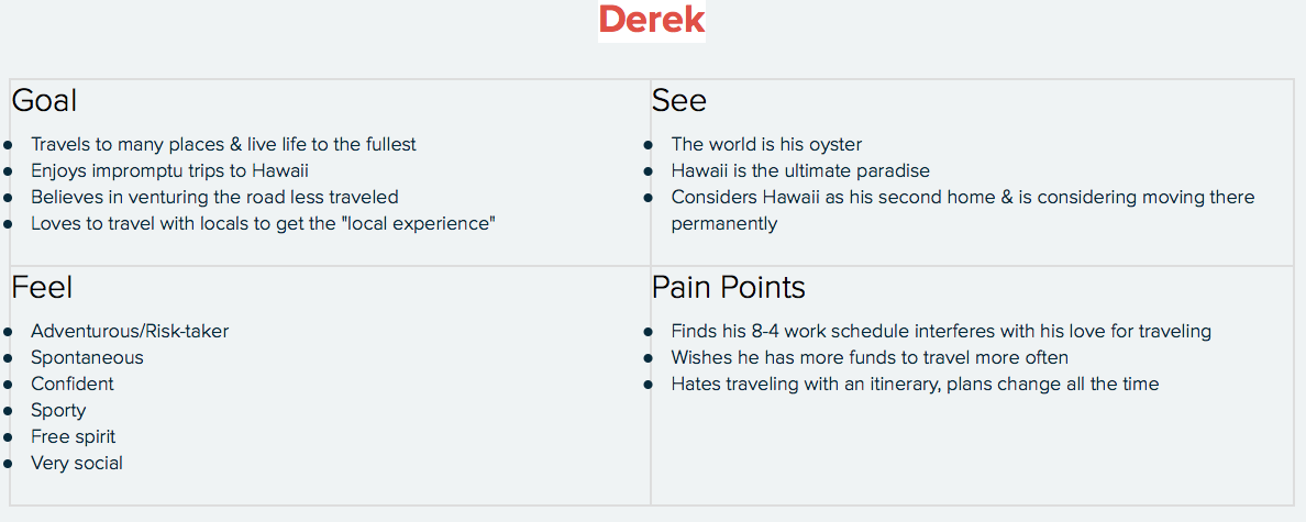
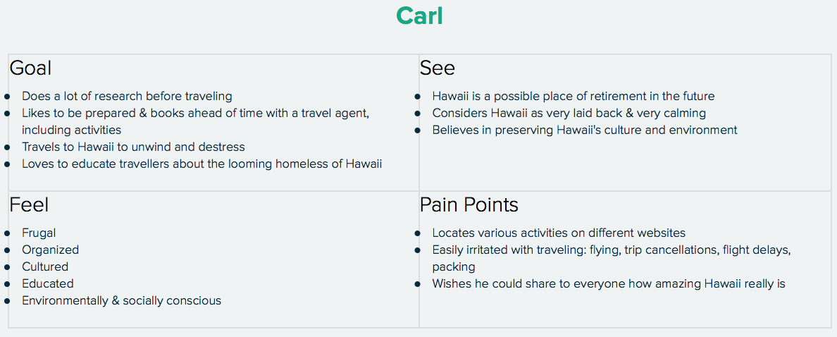
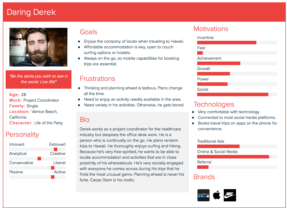
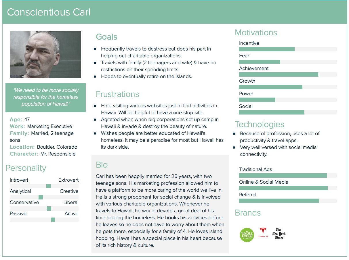
Based on responses of the online survey & interviews, I was able to come up with 3 diverse empathy maps, which lead to 3 very unique personas. The first was a daring, avid traveler & adventurous type. The second was a single meticulous mom who is very mindful of her budget. The third is a socially conscious family man, who has no budget restrictions.
Minimum Viable Product (MVP) & User Stories:
The MVP allowed me to explore six key functions of what I would like to add on my app, based on all of my findings.
The User Stories enabled me to have a deeper understanding of my users.
Information Architecture:
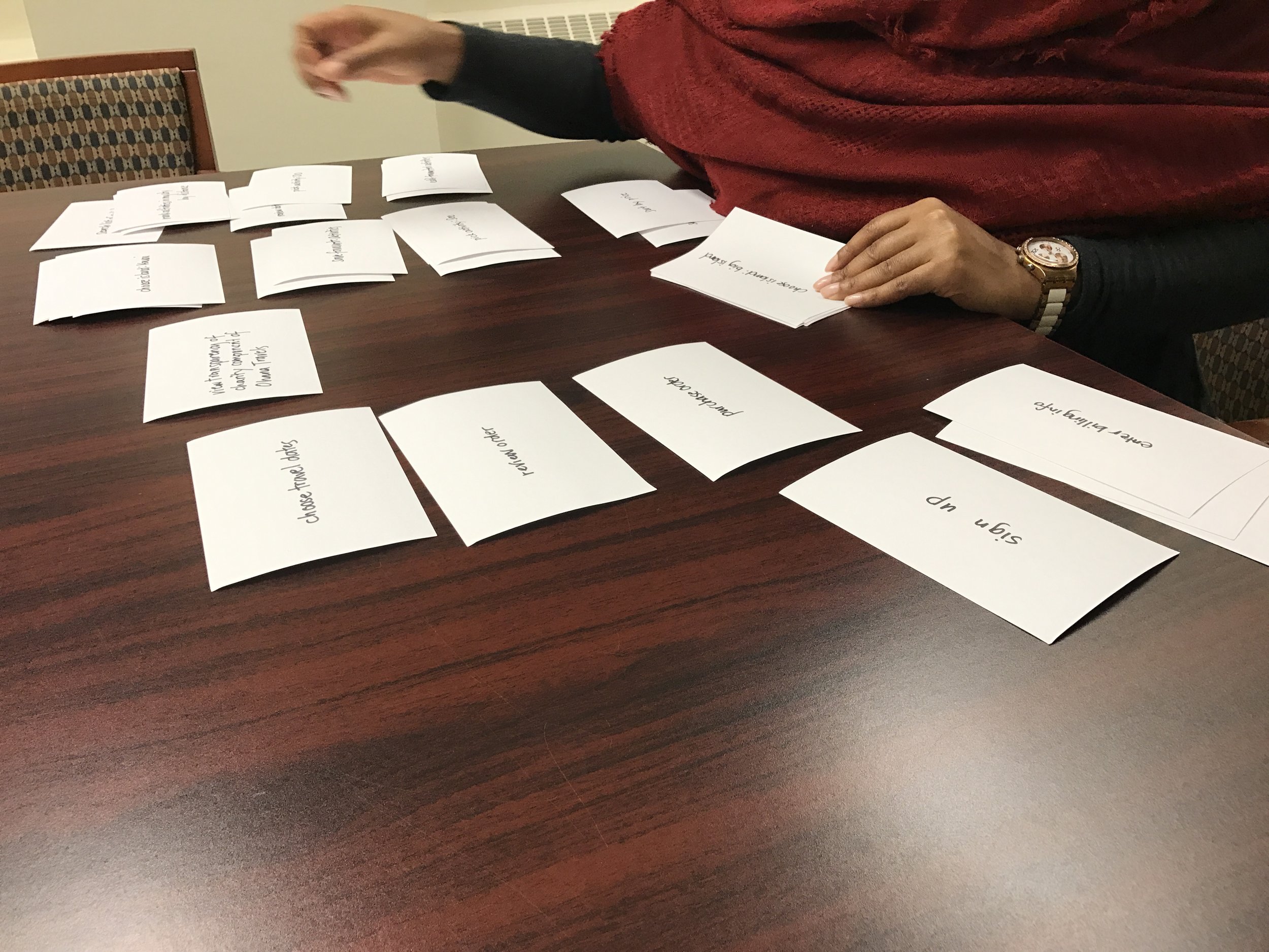
Content Strategy (Card Sorting & Site Mapping):
All personas were represented in my card sort. A person who was an avid Hawaii traveler, was the only individual to indicate that choosing the islands should be a part of the activities shopping experience, further proving my hypothesis that frequent travelers already have familiarity of the setup of Hawaiian travel sites.
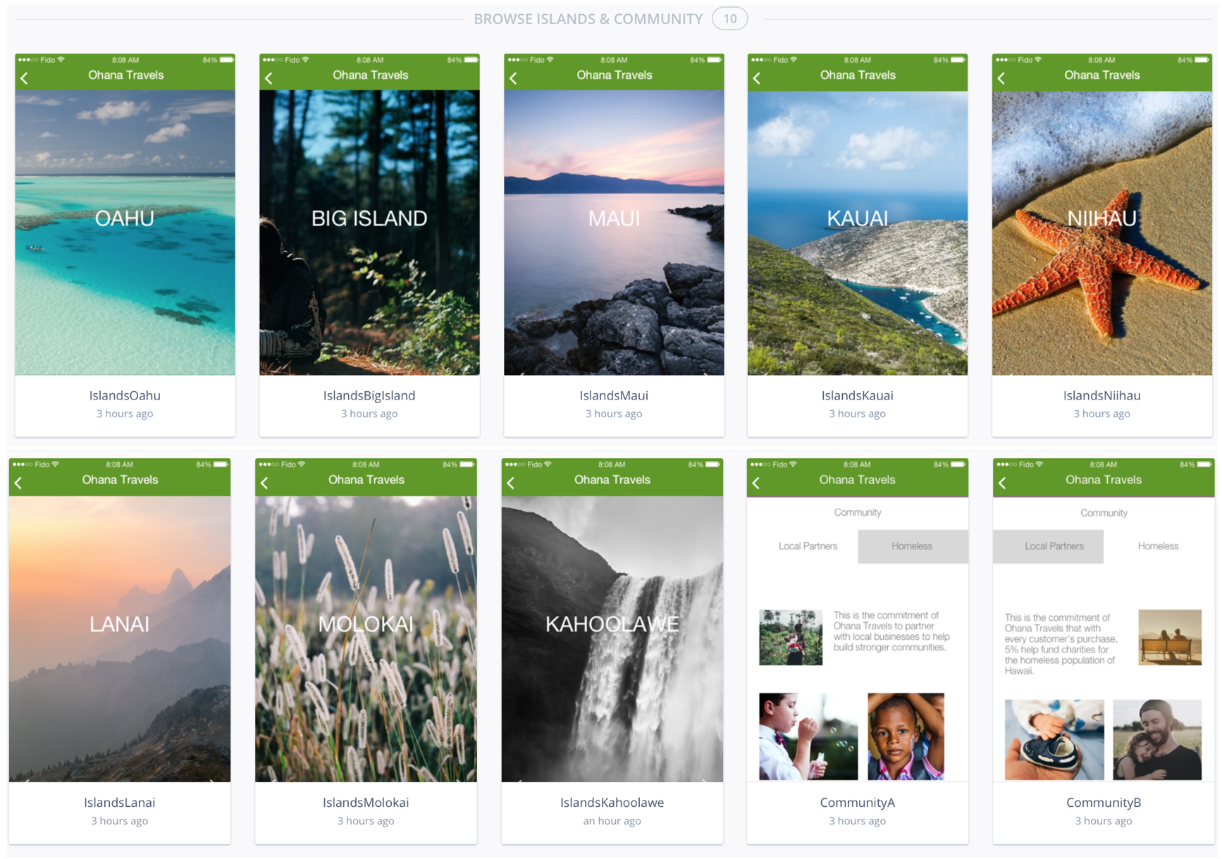
A new category evolved – Islands. It’s a dedicated page for new travelers to familiarize themselves of the 8 different islands.
Most users came up with “Our Community” for the transparency section. It fit with the aloha spirit I was trying to accomplish: Ohana, which means family.
By synthesizing & presenting findings on a chart, it allowed to form a general consensus of categories for the app.
Based on the categories created after the card sort, I was able to create a very straightforward sitemap using draw.io.
User Flows:
I created 3 scenarios using draw.io, for the user flows to test out the validity & functionality of the site map, using the personas.
DESIGN:
Sketching:
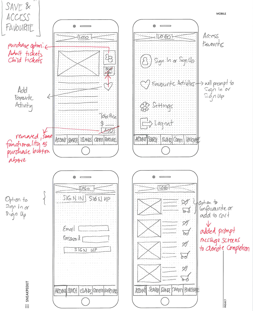
By doing an initial sketch using only a pen and pencil, I was able to iterate the basic architecture of the app through low fidelity wireframes. Through this process, I further iterated on colour, typography, modification of elements for ease of usability & further emphasizing the mission statement on the splash page & at the end of the purchase process.
Wireframing :
Using Sketch to translate my sketches into high fidelity wireframes, I was able to iron out functionality issues. This helped mold the visual component. I was able to play with fonts, sizes, colours and element configurations to help establish my brand guide.
Prototyping:
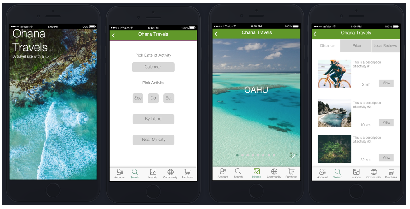
By integrating high fidelity wireframes into InVision, I was able to establish a working prototype. There were a lot of ideations, trials and errors and further usability testings.
A software limitation was the vertical scrolling option, one for the island descriptions & two for the confirmation page of the purchase. Maybe using proto.io, with more advanced prototyping features, will help alleviate this concern in future projects.
I’ve added prompts just to get the point across that an action is being completed.
Click for Prototype on InVision:
Style Guide:
The colour palette centred on a monochromatic warm green connecting with the nature in Hawaii. Various images of sceneries & backdrops already have a strong presence so a simple colour palette was sufficient. Whites & grays were added as a neutral.
The font Helvetica Neue Light was very minimalist, inviting and very relaxing. It's very reminiscent of Hawaii.
VALIDATION:
Key TAKEWAWAYS:
5 users did further usability testings. Personas were represented. The interview script helped the user accomplish the tasks efficiently, from start to finish.
Most concerns expressed had to do with prototyping software limitation such as selecting options, scrolling vertically and the ability to enter input.
The charity component at the end of the purchase (the users found) was very impactful & makes them feel good about themselves that they are contributing to a cause.
A map on the Islands description was a “nice to have” suggestion, especially for first timers.
Next steps will involve resolving software limitations.


